
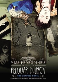
Miss Peregrine's Home
for Peculiar Children
~The Graphic Novel~
Miss Peregrine’s Peculiar Children
Book 1
By Ransom Riggs & Cassandra Jean
Amazon ~ Powell's ~ Jan's Paperbacks
for Peculiar Children
~The Graphic Novel~
Miss Peregrine’s Peculiar Children
Book 1
By Ransom Riggs & Cassandra Jean
Amazon ~ Powell's ~ Jan's Paperbacks
When Jacob Portman was a boy, his grandfather regaled him with stories of his fantastic life at Miss Peregrine's home during the Second World War, even sharing photos of the remarkable children with whom he resided. As Jacob grew up, though, he decided that these photos were obvious fakes, simple forgeries designed to stir his youthful imagination. Or were they...?
Following his grandfather's death—a scene Jacob literally couldn't believe with his own eyes—the sixteen-year-old boy embarks on a mission to disentangle fact from fiction in his grandfather's tall tales. But even his grandfather's elaborate yarns couldn't prepare Jacob for the eccentricities he will discover at Miss Peregrine's Home for Peculiar Children!
It seems I'm in a re-reading mood all of a sudden. What could be better than re-reading your favorite books? Why, getting to experience them again for the first time, of course! And that's exactly what Cassandra Jean has achieved with Ransom Riggs' intriguing novel about Peculiar Children. This graphic novel adaptation contains the same plot as the original novel, so if you're wanting a review of the story, you should probably click that big link up there. But if you're interested in how the adaptation came out, please read on.
First up: the art style. I don't have a ton of comic book, manga, or graphic novel expertise, so please don't shoot me when I say that I found the style very reminiscent of the Japanese manga. The book is very character-centric, with most panels focusing on the faces and expressions of the cast, and relatively few backgrounds or body shots. There are many segues which are accomplished with 2-3 blank bars, usually shifting from light to dark or visa-versa. The drawings are also more sketch-like, less polished than, say, a panel of Avatar for example. Not that it is bad or displeasing to the eye, but it isn't something you would care to dwell on either, so it does keep your eye moving along to the story.
The color scheme also plays into this. Done in the style of Wizard of Oz, all of the 'normal', 'real world' stuff is drawn in black and white. It's not until Jacob actually arrives in the land of the Peculiars that the art turns to color. It not only helps us easily distinguish which place we're in (in case you happen to get lost), but it also adds to the distinction Jacob has between the humdrum life he knows and the fantastical world he travels to. Of course, adding color for color's sake means nothing if there's no mood or feeling to it, and the book accomplishes this extremely well also.
Another art aspect is the inclusion of the original novel's photographs. Yes, all (or most) of those creepy photos are back in this adaptation. However, instead of devoting full pages to each one as it comes, most are shrunk down—significantly so in many cases—and used within panels or as backgrounds with Cassandra's art overlaying it. It may seem a little weird, seeing real-life photographs meant to represent drawn characters, but the photos aren't oppressive enough for it to be too bothersome. Ultimately it serves as a neat tie-back to the original, as well as keeping the story tied down to its creepy roots.
However, while the photographs served to link to the novel, I did find the differences between the two stories equally intriguing. As in all adaptations, changes must be made. As the comic-ish style lent more to quick-paced dialogue, many of the solo scenes with Jacob reminiscing, exploring the island, or thinking in his room were left out. Also dropped was much of the 'normal' life both before and after his grandfather's death, before he travels to the island, though I assume this is more for pacing reasons than lack of dialogue. I didn't really mourn any of the losses (except maybe one during the wight fight), figuring it's still in the novel for anyone interested to explore further.
And really, the pacing was perfectly executed. I flew through this book, and I think I would have even if I hadn't already known its story. The simplistic art style, the mostly dialogue-based text, the removal of extra characters and backstory scenes, everything combines to get you hooked and keep you reading. There are no huge text blocks to slog through, no intricate art pieces to comb over, just peculiar characters and a mysterious story moving you forward, all the way until the end. And even then it includes the animated 1st chapter of the second novel, Hollow City, so there's even more to read through!
Overall I found the graphic novel of Miss Peregrine’s Home for Peculiar Children to be an excellent adaptation and all-around visual treat. I think it will appeal to fans of the original, as well as intrigue newcomers into discovering and sticking with the peculiar series. The creepy photos are still there, along with visually depicted gun violence, but I wouldn't say it's graphic enough to discourage middle graders (and above) from reading it. So if you find yourself with some extra time on your hands, and are looking for an edge-of-your-seat story with history, fantasy, and art, then Miss Peregrine’s Home for Peculiar Children: The Graphic Novel should be your first stop.
Approximate Reading Time: 1.5 Hours
No comments :
Post a Comment
Let me hear you howl!